Midjourney and the Science of Color

Color theory is both the science and art of using color. It explains how humans perceive color; and the visual effects of how colors mix, match or contrast with each other. Color theory also involves the messages colors communicate; and the methods used to replicate color. For example, teal is a mixture of blue and green. The compliment of blue is orange; green is red. In the image above I used tertiary colors: matching teal with its earthy compliments. What I have discovered is that Midjourney does a great job at translating colors in text prompts.

Synthographie published a cool chart with colors to use in prompts. However, I use other colors in mine such as teal and vermillion. This color knowledge came from taking the required “Light, Color & Design” courses during my foundation year at Pratt Institute. Our required textbook was Josef Albers’ Interaction of Color and our materials/supplies consisted of ColorAid paper, X-acto knives, and spray adhesive.
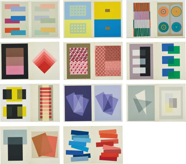
We had to use our materials to replicate the color theory principles in the book, replacing the colors used in the book with our own. Mrs. Buckley, our professor, was a stickler for smooth surfaces and no gaps where the edges of the cut shapes met. In the second semester, we were instructed to apply what we learned in our art. Years… decades later I used some of those color studies as a guide for Midjourney image generation. I uploaded my old color studies and used the software to “describe” them. Then, I chose a text prompt as the template for the creation of new images.


In the above image, I used the original painting in the prompt and the generator/software maintained the color harmonies and general composition. Eventually, I removed the reference image, which resulted in images such as these:

Harmony is a dynamic equilibrium. I found that Midjourney is great at conveying color harmony that delivers visual interest and a sense of order. Once I found my stride I began modifying the “template” text prompt to remove the bench and include other subjects such as children:

It’s been decades since I took classes with Mrs. Buckley but the knowledge I obtained from her instruction stays with me today… and has made it into Midjourney, which conveys color interactions better than most online generators or tools. The use of color theory (hues, harmony, context) in AI-generated imaging is what separates artists from non-artists. In my opinion, color theory is what makes these images stand apart from many of the others. Of course, composition and style are also important.